
Introduction to modern web design
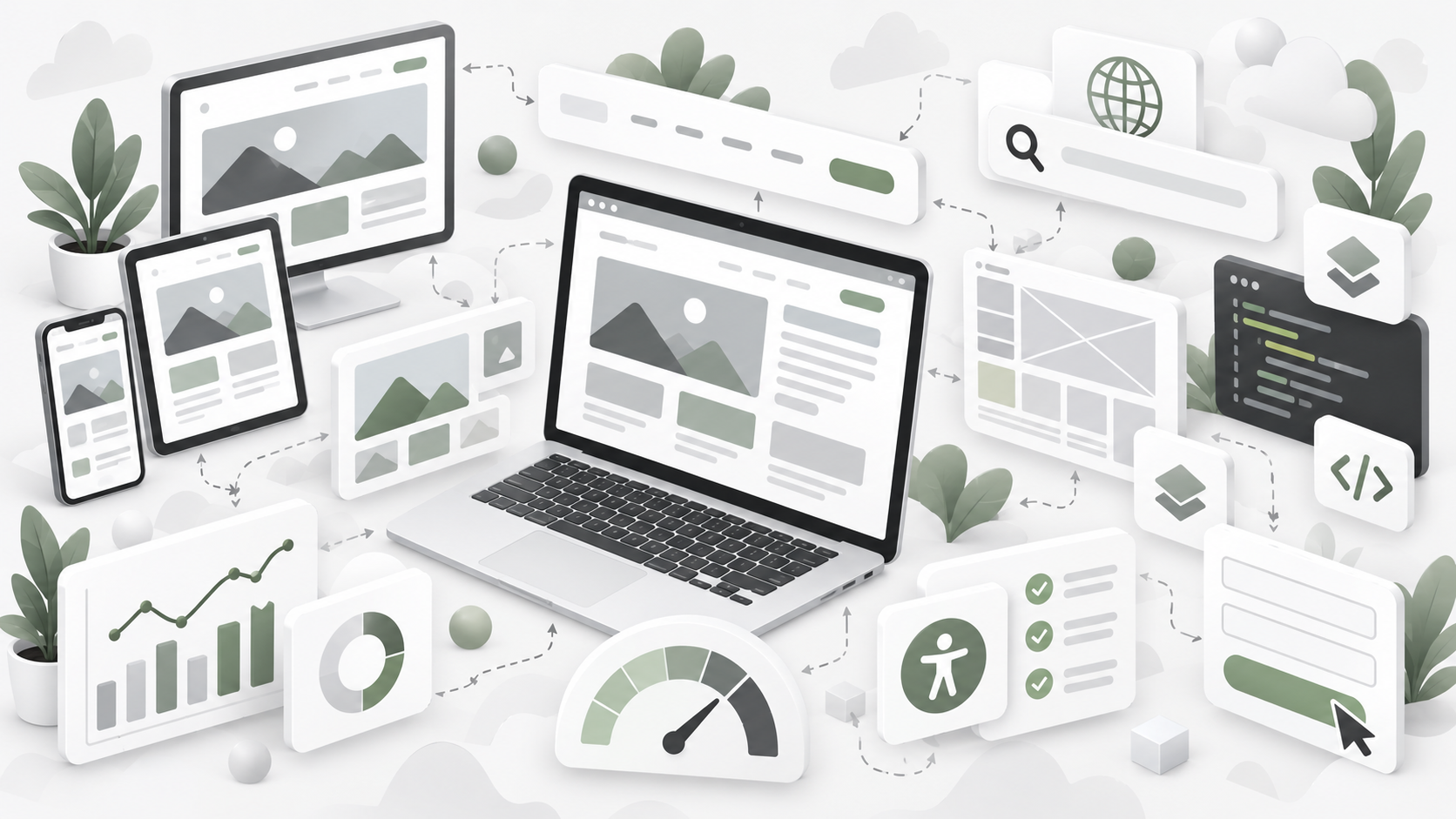
Web design in 2026/27 is about much more than making pages look attractive. It encompasses planning, conceptualising, and arranging content online, blending visual elements with user experience design and the technology that brings everything together. A well-designed site balances visual appeal, performance, and clear purpose for your own website.
Web design focuses on the user-facing aspects, whereas web development pertains to the technical coding that enables site functionality. This distinction matters because a web designer shapes how visitors perceive and interact with your brand, while developers handle the machinery underneath.
Web design covers key areas including layout, content production, graphic design, and navigation structure. A good web designer blends artistic vision with technical functionality, working alongside UX designers who map user journeys and ensure the site actually works for the people using it.
This guide covers the core design principles that underpin good web design, responsive web design for mobile devices, the functional and visual elements that shape user experience, and how to choose the right platform for your project. Whether you are building a simple brochure site or a larger content-led business website, the thinking behind these decisions matters more than any single tool.
Why web design matters for your business
Professional website design builds trust before a visitor reads a single word. A 2024 Stanford study found that 75% of users judge a company’s credibility based on its website design alone. That number rises to 94% on mobile, where first impressions form in roughly 50 milliseconds.
Good web design connects directly to visibility in search engines. Google’s mobile-first indexing rewards responsive, fast sites with better rankings, which translates into more organic traffic and lower acquisition costs. Search engine optimisation is crucial for improving a website’s visibility and ranking, making your site more discoverable to potential customers.
The link between design and revenue is measurable. A local bakery that redesigned its site with clear calls to action, mobile optimisation, and a streamlined layout saw enquiries rise 150% and revenue increase 40% within six months. A positive user experience is crucial for retaining visitors—if users perceive a website as useful, they are more likely to return, enquire, or buy.
Even local service businesses benefit from a well-structured, conversion-focused site. A plumber with a clean, accessible website featuring testimonials and a simple booking form can generate twice as many leads as a competitor with an outdated, cluttered layout. Website design is not just about aesthetics. It is about turning visitors into customers.
Core web design principles
Design principles form the foundation for good web design, regardless of which design software or tools you use. Good web design follows certain principles to have a cohesive look and feel, including balance, contrast, emphasis, rhythm, movement, hierarchy, unity, and white space. These ideas come from Gestalt psychology and remain consistent even as web design tools are updated over time to comply with new standards and software changes.
User experience design is the lens through which these principles are applied. It is not enough for a page to look pleasing. It must also be usable, scannable, and clear. The fundamentals behind great design have not changed, even if the trends have.
Balance and hierarchy
Visual balance creates equilibrium on a page, helping users scan content comfortably. Symmetrical layouts communicate stability and trust – think centred e-commerce homepages. Asymmetrical layouts create energy and can retain attention longer, useful for creative portfolios or campaign pages.
Visual hierarchy arranges page elements to guide users toward important information, such as call-to-actions. The principle of hierarchy in web design emphasizes placing the most important items at the top of the website, ensuring that critical information is prominent and easily accessible.
A simple homepage example: logo and primary navigation at the top, hero section with a large headline and prominent button above the fold, three-column services grid below that stacks to single-column on mobile, and footer links at the bottom. This structure reduces cognitive load and directs attention where it matters.
Contrast, emphasis, and rhythm
Contrast in colour, size, and spacing draws attention to key actions. A bold “Book a Call” button in a high-contrast colour against a muted background will collect more clicks than a button that blends into the page. Clear call-to-actions utilise strong, clear buttons to indicate user next steps.
Emphasis spotlights what matters most. In a hero section, a large headline in your brand colour and a glowing button should dominate the visual field. Everything else supports those two elements.
Rhythm emerges from repeating patterns across pages – consistent heading sizes, uniform button styles, predictable section spacing. Consistency in fonts, colours, and button styles builds brand credibility across web pages. Before a redesign, a cluttered site with overlapping elements and tiny fonts might have a 65% bounce rate. After applying rhythm and contrast, bounce drops to 35% and time on page doubles.
Unity and white space
Unity means all visual elements feel like part of one brand. Shared button styles, consistent imagery tones, and cohesive colour choices make a site feel intentional rather than cobbled together.
White space is crucial in web design as it helps reduce cognitive load, making it easier for visitors to perceive and navigate the information presented on the screen. Purposeful use of whitespace reduces clutter, allowing users to focus on content.
Common mistakes include cramped navigation bars with too many items, tightly packed paragraphs, and edge-to-edge elements with no breathing room. A practical rule: maintain at least 32px spacing around headings and sections, 24px between cards, and 16px between smaller elements. Generous white space improves comprehension, especially on long-scrolling pages.
Responsive web design and layout choices
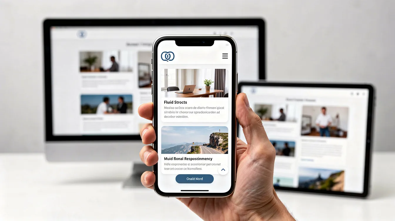
Responsive web design became essential after smartphones overtook desktop traffic around 2015. Today, mobile accounts for over 60% of global web traffic. Responsive web design is based on CSS3 and utilizes the CSS @media rule to create layouts that adapt fluidly to different screen sizes.
The value of responsive design lies in its ability to constantly change according to the screen size being used, providing a seamless user experience across devices. This differs from adaptive design, where adaptive websites have two or more versions that are customized for specific screen sizes. Fixed layouts, locked to a single pixel width, are now obsolete – most users will simply leave.
Search engines reward mobile-friendly design with better visibility. Google’s mobile-first indexing means your mobile experience is what gets ranked, not your desktop layout. Navigation bars, grids, and columns should all shift gracefully between desktop, tablet, and mobile without breaking.
Designing for different screen sizes
A typical three-column desktop layout might collapse to a single-column layout on mobile. The priority shifts: logo and menu first, key message and primary call to action next, supporting content below.
A mobile-first approach prioritizes mobile screens in design for better performance and search results. This means designing the constrained experience first, then expanding for larger screens, rather than shrinking a desktop design down.
Buttons and form fields need thumb-friendly sizes – 44×44 pixels minimum, with 8-16px spacing to prevent mis-taps. Bento grid layouts enhance visual hierarchy, making content easier to scan on mobile devices. On a responsive product page, the image carousel sits at the top, followed by title, price, and a full-width “Add to Cart” button sized for easy tapping.
Navigation bars and site structure
Clear navigation bars reduce exits and help users find what they need. On desktop, a horizontal bar with 5-7 primary items works well. On mobile, this collapses into a hamburger menu revealing a vertical list.
A simple sample menu for a small business site might include: Home, Services (with dropdown for subtypes), About, Blog, and Contact. This keeps the primary navigation clean while grouping secondary pages logically.
Intuitive navigation should be simple and consistent so users can easily find information. Consistent navigation also supports how search engines crawl your site, improving indexation. Flat architecture – where any page is reachable in three clicks or fewer—helps both users and crawlers.
Functional elements that shape user experience
Functionality is everything that happens behind the visuals: speed, structure, forms, search bars, error messages, and interactions. User experience (UX) design focuses on how users interact with a website, emphasising layout, clear instructions, and labelling to enhance usability.
Good web design considers forms, feedback states, and error pages, not just layout. Effective UX design aims to reduce cognitive load, making it easier for users to navigate and understand a website, which can significantly improve user satisfaction.
Speed, performance, and technical basics
Pages should load in under 2-3 seconds. Research shows 53% of mobile users abandon sites that take longer, and a 1-second delay can drop conversions by 7%.
Optimising images and reducing heavy scripts enhance loading speeds, which in turn lowers bounce rates and boosts user satisfaction. Optimising assets through lightweight formats like WebP or AVIF shortens page load times and contributes to lower abandonment rates and reduced user frustration.
Modern design trends prioritise underlying technical performance, replacing heavy 3D web code with lightweight CSS alternatives to reduce processing lag. One client cut load time from 5 seconds to 1.5 seconds simply by compressing images and deferring non-critical scripts. Bounce rate dropped 40%.
SEO foundations in web design
How you structure pages affects how search engines understand your content. Effective SEO practices include using headings in content, adding alt text to images, and utilizing meta descriptions to enhance search engine indexing. Clean URLs (/services/plumbing rather than /?p=123) also help.
Plan page structure with both SEO and user journeys in mind: home page, key service pages, blog or resources section, and contact. Websites that are optimised for SEO are more likely to attract new visitors, as they rank higher in search engine results.
Avoid bloated, template-heavy designs that slow pages and dilute content focus. Every design decision – from heading hierarchy to internal links – either supports or undermines your organic traffic potential.
Accessibility and inclusive design
Accessible design is part of good user experience design, not an add-on. Ensuring accessibility involves adhering to established standards to make the site usable for all individuals, including those with disabilities. Accessible and inclusive design, compliant with WCAG standards, broadens usability to all visitors, enhancing trust.
Cover the basics: readable font sizes (16px minimum body text), sufficient colour contrast (4.5:1 ratio), keyboard navigation support, and descriptive link text. Voice user interfaces facilitate hands-free, intuitive navigation, increasing accessibility for users. Dark mode design features reduce eye strain and improve comfort.
Three quick accessibility checks any web designer can perform: run a Lighthouse audit for accessibility scores, test keyboard navigation without a mouse, and verify colour contrast with a browser extension. Accessible sites tend to perform better in search and deliver a smoother experience for everyone.
Visual elements: making your site look and feel on-brand
Visual elements give your own website its personality and brand presence. This layer includes colour, typography, imagery, iconography, and animation. Visual styles in web design embrace high-energy colours and custom illustration storytelling, while core UX architectures are returning to predictable conventions.
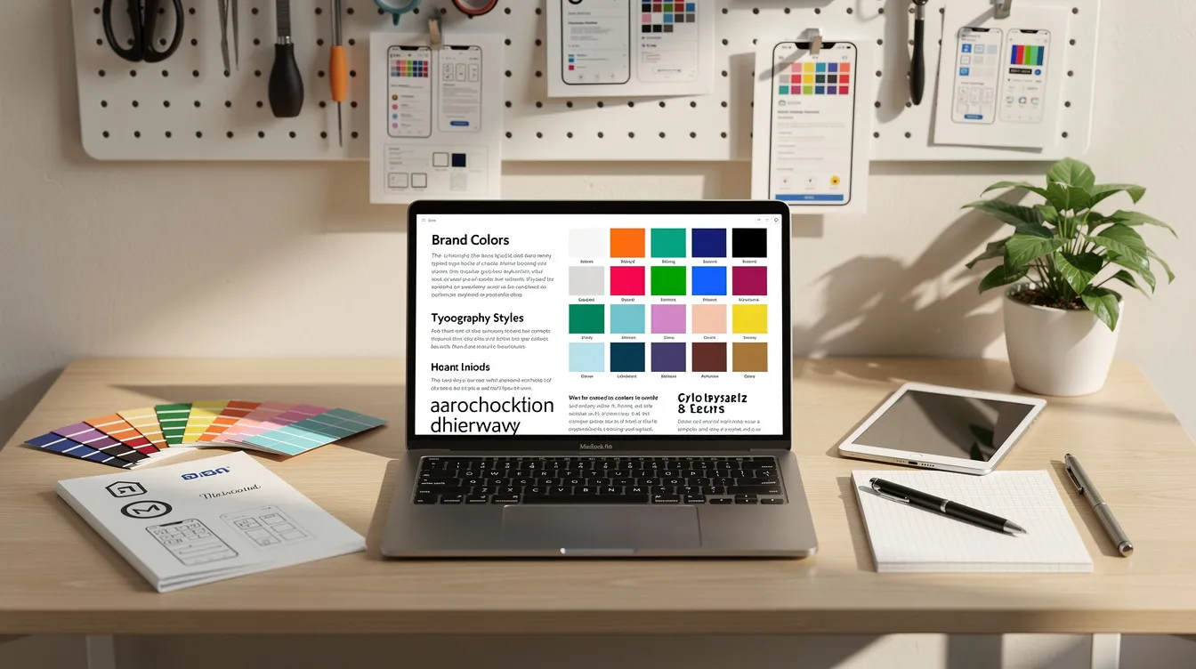
Before designing individual pages, define a simple design system: your colour palette, type scale, button styles, and spacing rules. This keeps everything consistent and speeds up the development process.
Colour, typography, and spacing
Choose a limited colour palette—primary, secondary, and accent—to keep the user interface cohesive. Web design trends in 2026 favour high-energy visuals, such as 3D elements and bold typography, combined with minimalist layouts for improved performance.
Pick 1-2 typefaces and use consistent font sizes for headings, body text, and navigation. Minimalist design keeps text concise and layouts clean to avoid overwhelming users with too much information. Websites leverage functional minimalism alongside large, bold typography to enhance user navigation and conversion rates without needing users to learn new digital interfaces.
A simple style guide for a small brand site might specify: primary colour #2D3748, accent #4299E1, heading font Inter at 48/36/24px, body 18px with 1.6 line height, 32px section spacing, 24px card padding. Consistent spacing reduces clutter and supports visual hierarchy.
Imagery, icons, and motion
Use real photography and clear icons that support your content, rather than generic stock images. Top platforms are moving towards humanised design touches, utilising hand-drawn graphics and controlled imperfections to create user empathy and brand authority.
Subtle animation can improve user experience – hover states that lift buttons slightly, scroll-based reveals that bring sections into view. A button that expands 5% on hover with a soft shadow creates feedback without distraction.
Sustainable web design focuses on energy-efficient and lightweight websites that load faster and appeal to environmentally conscious users. Fast websites align with eco-friendly web design practices. Avoid heavy video backgrounds or aggressive parallax effects that harm performance. Motion should enhance, not overwhelm.
Choosing the right platform and tools
Platform choice should come after defining what your website needs to do. A simple landing page, a small brochure site, a content-heavy business website, and an ecommerce store all have different requirements. The platform should support the strategy, the content, the design, the maintenance, and the long-term direction of the project.
Web designers use a variety of tools including vector and raster graphics editors, WYSIWYG website builders, and content management systems to create and manage websites. Web design tools are updated over time to comply with new standards and software changes, but the fundamental principles behind them remain consistent.
Static websites store a unique file for each page, while dynamic websites generate pages on the fly using server-side technology and databases. Understanding this distinction helps match platform capabilities to project needs.
Matching project types to platforms
For smaller brochure sites and straightforward content-led projects, modern WordPress Full Site Editing with tools like Ollie offers ownership, flexibility, and a clean editing experience without heavy page builders. It works well when the site does not need to be over-engineered but benefits from a solid foundation.
For very focused one-page websites – landing pages, campaign pages, waitlist pages—Framer is strong when the aim is to move quickly and create something polished. It feels closer to a design tool than a traditional CMS, useful for visual, presentation-led work.
Larger design-led marketing sites often suit Webflow, which balances design control with structured CMS collections and clean editing workflows. For larger sites needing deeper flexibility, custom WordPress with GeneratePress and GenerateBlocks offers lightweight, extensible builds shaped around the project.
For ecommerce, if the business is primarily about selling products, Shopify is built around commerce from the ground up. If ecommerce needs to sit inside a wider content-led WordPress site, WooCommerce makes more sense – though it requires more technical consideration.
Project Type | Platform Direction |
|---|---|
Small brochure site | WordPress FSE / Ollie |
One-page landing page | Framer |
Larger design-led site | Webflow |
Flexible content-led site | GeneratePress |
Ecommerce-first store | Shopify |
WordPress-integrated commerce | WooCommerce |
Design software and workflows
Before development, most web designers prototype in design software like Figma, Sketch, or Adobe XD. These tools allow creating wireframes (low-fidelity layouts) and high-fidelity mock-ups before building in the chosen platform.
A lean workflow follows this sequence: plan the sitemap, design key templates in Figma, prototype interactions, build in the platform, test usability, and iterate based on data. Hand-off between designer and developer should include style guides, component specs, and content structure to ensure nothing gets lost in translation.
The goal is to reduce surprises. Plan thoroughly, design intentionally, build efficiently, and improve continuously.
AI and the future of web design
AI tools now assist with drafting copy, generating imagery, and exploring layout ideas for website design. AI-powered personalisation allows websites to adapt in real time to user behaviour, enhancing engagement and relevance. This is genuinely useful – especially for speeding up production.
AI can help with page outlines, micro-copy variations, content briefs, code snippets, and repetitive development tasks. Latest trends in web design focus on intelligent personalisation, physical realism, and functional simplicity to improve user experience.
But AI is not the strategy. It can produce options but does not automatically know which option is right for the target audience. It can generate layouts but does not replace design judgement, accessibility thinking, or long-term maintainability. AI works best when it sits inside a proper process built around understanding the business, clarifying goals, and designing for real users.
The value is in knowing where AI helps, where it gets in the way, and where human judgement still matters. Used well, AI can help create better websites faster. Used badly, it produces generic copy, shallow strategy, and sites that look and sound like everything else.
Platform choice matters. Design principles matter. Performance and accessibility matter. But the thinking behind all of these decisions matters more. Start with what your website needs to do, then work backwards to choose the tools and approaches that fit.